
Community Needs Mapping
Define.Analyze.Understand.
Map your programs,
your reach,
and the people you serve.
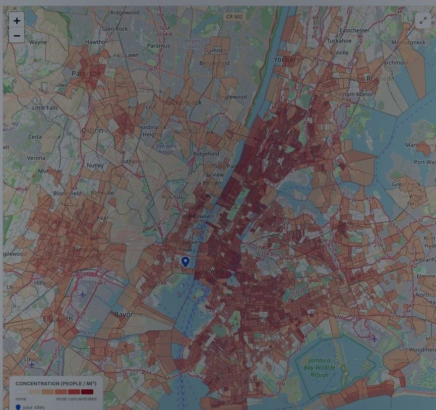
Overlay every site you run on the communities around it — across dozens of population vectors — and see exactly where need outpaces reach, and where your next program or location should go.
Ask Sarah to analyze your mapOne map, dozens of vectors
Every layer of need, in one view.
Toggle Census measures and health-risk layers to see where vulnerability actually concentrates — then drop your sites on top and watch the gaps appear.
Below poverty lineUnemploymentSNAP & public assistanceNo vehicle accessChildren under 18Older adults 65+Single-parent familiesVeteransLimited EnglishAdults with diabetesUninsured adultsSocial Vulnerability IndexPeople with IDDChildren with autismReturning from incarcerationExperiencing homelessness
Direct measures come from the US Census (ACS 5-year, by tract). “Est.” layers apply published prevalence rates (CDC PLACES, Vera Institute) — estimates, not counts.
Sarah reads the map
She doesn’t just show you the map. She tells you where to grow.
Not just a heatmap — a ranked, defensible growth plan built from the same data your funders trust.

SarahFitProof Intelligence · Your AI Mission Advisor
I compared your 8 sites against poverty, SNAP, vehicle access, and IDD prevalence across 4,000 tracts in your service area. Three things stand out:
- Severe unmet need in the South Bronx. Top-decile social vulnerability — and no site within 7 miles.
- Your Jersey City site is well-placed. It already covers its highest-need tracts — extend hours before you think about relocating.
- Autism-service demand is rising in Bergen County and unserved by your current programs.
Grounded in 4,000 Census tracts · 8 of your sites
87High
Top opportunity scoreSouth Bronx, NYof 4,000 tracts analyzed
New site87
South Bronx, NY
41k below poverty within 3 minearest site 7.2 mihigh IDD prevalence
Expand program79
Autism services — Bergen County
rising demandonly 2 area providersfits your IDD expertise